Roast my Product Episode 1: Luigia digital menu

K.Wirz
3 min read
Dec 13, 2023
Introduction
Luigia is Katy's and her husband's, Tamino, favourite restaurant.
She goes there often, being attracted by the quality of the food and drinks they offer. She feels like it is a great place to take her friends and family to because, as she says "it's a banger every time."
The only downside of her experience as a guest at Luigia, the Italian restaurant chain, lies at the palm of her hand when she visits. Read on to find out how we fixed Luigia‘s guest experience in less than 30 mins by just changing up the design a bit.
Important: The following blog post is not meant to offend or critique, the intention is to put our design-thinking to work as a team and to nudge businesses to make user experience a priority.
Our mission is to build great products and experiences for users, and we see this series as a way to stretch those muscles and to show businesses and startups the "easy fixes" to build more satisfying customer/client experiences.
Section 1: Let‘s start off with some user stories.
First time visiting Luigia:
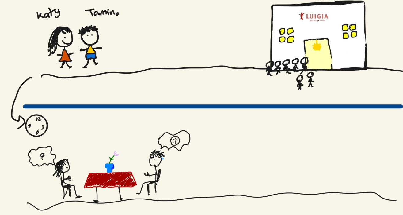
Experiencing Luigia starts before you reach the front door. Roya, our lead designer, conveniently provides us with some visuals to bring our user story to life.
- Katy and Tamino are hungry guests. They haven't made a reservation at the restaurant, meaning they are subject to lining up. Sometimes, especially on popular weekdays, Luigia is pretty packed and you might just need to line up outside for a while.
- So Katy and Tamino wait. They smell the awesome scents wafting from the kitchen and "Oh!" they spot a beautiful woodfire pizza oven as they enter the restaurant, thankful for the warmth after standing in line for a bit outside.
- Its been ten minutes, they finally are seated and are confronted with no other than a QR code to scan for the menu. No worries, both have their phones and they proceed to scan.
- Fifteen minutes have gone by since Katy and Tamino arrived at Luigia, their hunger has grown. What is something that does not mix well with hunger? Frustration.
- Katy scrolls, and scrolls, and scrolls and scrolls through the menu just to find out that her menu is in French as soon as she stops at an image of a dish she thinks looks good. With her limited knowledge of French, she only understands that the dish is not for her- it has a fish emoji and she is vegetarian. So she keeps scrolling.
- Meanwhile, Tamino‘s given up and defaults to his usual choice at any pizza place: Margherita with buffalo mozzarella and extra mushrooms and some sparkling water to wash it down.
- Katy, dedicated to try something new, sighs. Locks her phone screen and just goes with whatever Tamino chose X2.
- The food arrives, its absolutely delicious, but these two full-bellied guests feel like they‘ve missed out on what the restaurant has to offer.
Visiting Luigia after the first visit:
- The next time these two have a date night, they decide to go again despite the experience with the online menu. This time, they have a plan.
- As Tamino scrolls through the menu while they are standing in line to get seated, Katy jots down the food they like the sound of and meets their dietary preferences based on the emojis next to each dish. Katy uses the native note-taking app on her iPhone to do this.
- As soon as the waiter/waitress comes to take their order, they are prepared.
- Their food arrives, and date night is a success. Now that they have a personal little menu saved on a note on Katy‘s phone, they wont bother with Luigia‘s menu and just keep ordering from her note every time they visit.
Section 2: What problems can we identify from the user stories above?
- The time spent exploring the menu is not productive. Users are not going through the menu to "explore", instead they rush through it since the list is so long.
- Users are sticking to old habits. They order what they know, instead of trying something new. This lowers the authenticity of the experience as a guest at Luigia.
- Users are ordering only to satisfy their hunger, not to try different items from the menu for the sake of the experience.
Section 3: The Fix
3 big problems result thanks to the never-ending Luigia menu. To fix that, we‘ve come up with a better flow.
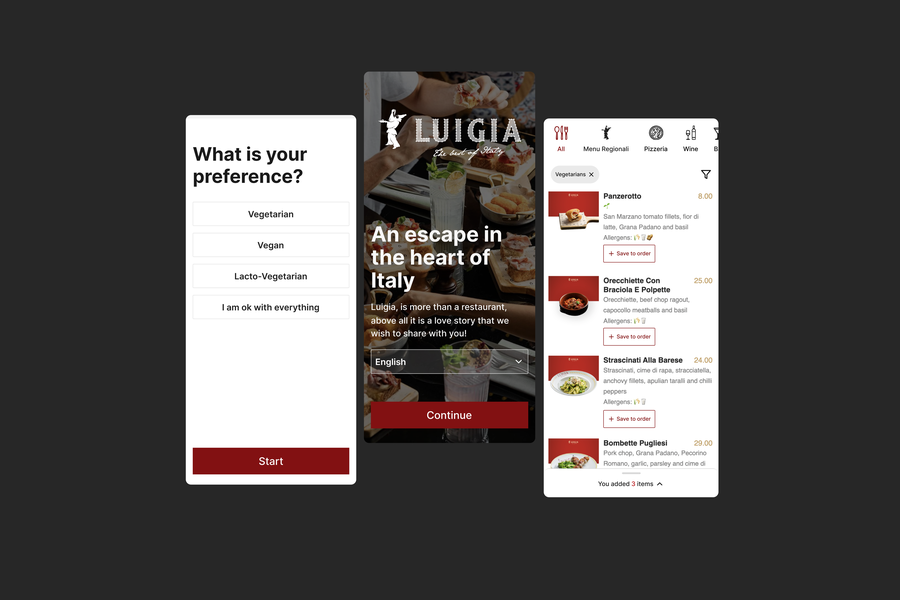
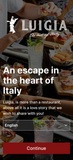
Scan the QR code, and you are met by a friendly face. Choose your language and continue.
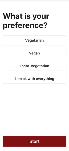
Select your dietary preference. A filter is then applied for you as you start to explore the menu.
After selecting your dietary preferances, check out the menu in your own time, with only the veggie options being displayed to you. We also added a sticky header so that you can jump between sections in the menu easily, no matter where you are in the menu.
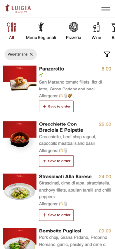
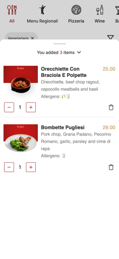
We added a "save to order" option that conveniently opens up in a little menu bar that you can pull down to further explore the menu as you add items to your order. When you are ready, the waiter/waitress only has to check your phone to know exactly what you‘d like to order. Easy peasy!
Conclusion
Sometimes, easy fixes are really as easy as this. By just having added a proper user flow to the Luigia menu experience, we‘ve solved all the user pain points we illustrated in the user stories section above. To jog your memory: Katy struggled to choose her meal, Tamino ordered what he just usually gets out of frustration with the long menu and to counteract this for the next time they went to the restaurant, Katy started keeping a note and collecting the vegetarian friendly options on the note-taking app on her phone.
If you‘d like to see us do more little projects like these, feel free to send us your proposal to kwirz@pyango.ch with the subject "Roast my (insert your project name)". We are really looking forward to more of these!
A bit about the team
We are a group of startup-orientated techies who dream of a world filled with opportunities for early stage startups. We love to support founders who are at a later stage, as well, but our dream is to see more young businesses take off thanks to our cost friendly all-rounder service package for startups. We call it CTO as a Service. Everything you need, from design to implementation, we take care of. It doesnt only stop there- you could consider us as your partners. With a direct line of contact via discord and regular update calls (a.k.a sprints), we‘re there to advise you to make the right decisions for your users. In the recording of the podcast episode for this roast, you meet the most front-facing part of the team, the product team, who will help you build a well-researched tech product/solution for your users, not just an interim solution that costs you thousands. To learn more, check out our offering here. It shouldn't take you more than 6 minutes to know whether its the right offering for you.
More

The most fundamental product validation method you need to know as an entrepreneur.
The Moscow Method
3 min read
Apr 12, 2024
